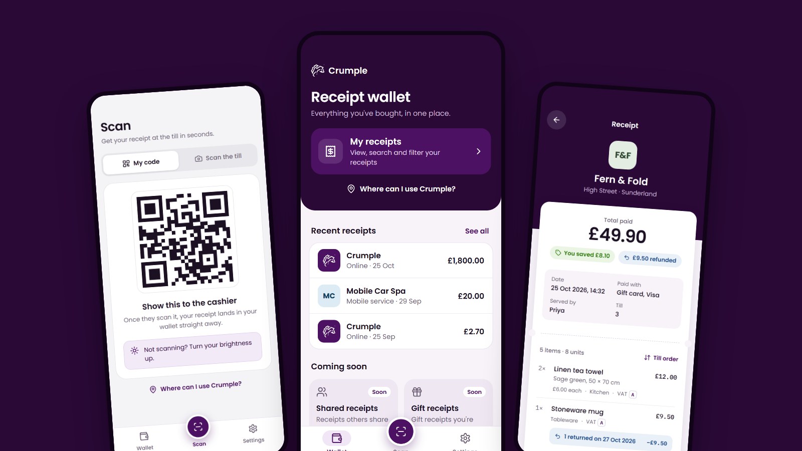
The Crumple app has a brand new look. Every screen has been redesigned, from the moment you open the app to the settings you rarely visit, and the new version is out now on iOS and Android.
What the app does has not changed: it keeps your receipts safe in one place. What has changed is how easily you can find them, read them and use them. This article walks through the thinking behind the redesign and shows the old app and the new one side by side.
Why we redesigned the app
The first version of Crumple did its job, but we knew it could be better. Almost everything sat on the same dark purple gradient, even in light mode, so no screen stood out from the next. The wallet gave most of its space to our logo and to features that were not ready yet, and your actual receipts were a tap away.
A receipt is something you look up in a hurry - at a returns desk, or with a warranty claim in front of you. We wanted an app that gets out of the way at that moment, and that feels like one product from start to finish.
How we approached it
We started by capturing the app as it stood, screen by screen, and pinning it up beside the new work so we could judge every change against what it replaced. From there, the design grew to more than 90 screens, states and components.
We explored widely before settling. The welcome screen alone went through 13 concepts, from a wall of receipts to a three-step tour, before we chose the one in the app today: a crumpled receipt that smooths itself out, under the line “Nothing left to Crumple”. A few principles guided the rest:
- Your receipts come first. Our branding should frame your content, not compete with it.
- Design every state. Not just the ideal screen, but the empty wallet, the first load, the pull to refresh and the moment something goes wrong.
- Build it once. The tab bar, alerts and dialogs are each a single shared component, so they look and behave the same everywhere.
- Light and dark, together. Each screen was designed in both themes, so neither feels like an afterthought. We are showing light mode here.
Before and after
Here are the screens you will use most. The new designs use sample data, so the shops and amounts will differ from the ones in your own wallet.
Receipt wallet
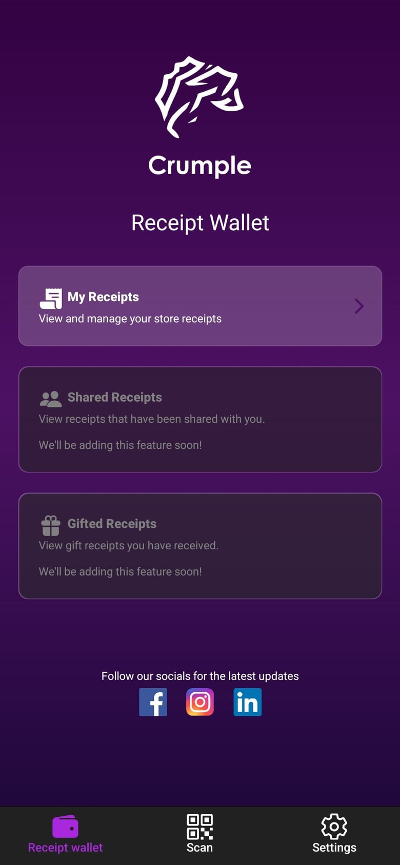
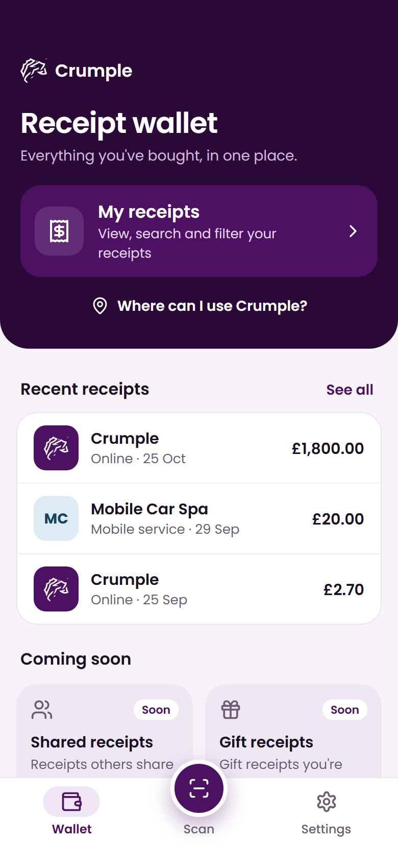
The wallet is the front door of the app, and it has changed the most. The old screen was three large cards, and two of them were for features still to come. Now your most recent receipts are right there when you open the app, with My receipts one tap above them. Shared and gift receipts are still on their way, but they have moved down the page into two small tiles, and a new link shows you where you can use Crumple.
Before
After
My receipts
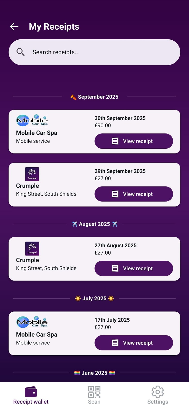
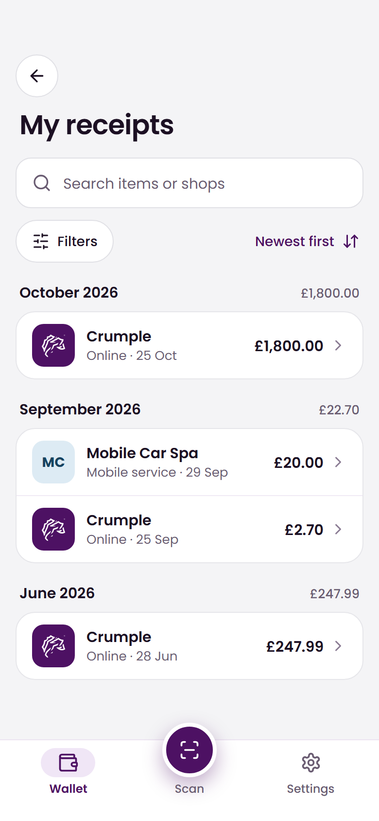
Every receipt used to be a large card with its own “View receipt” button. Each one is now a single clean row showing the shop, the date and the amount, and tapping the row opens it. Receipts are still grouped by month, but each month now shows what you spent in total. Search covers both items and shops, with filters and sorting directly beneath it.
Before
After
Receipt viewer
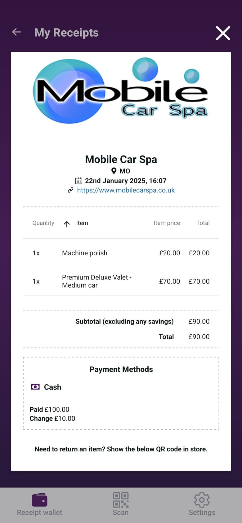
This is the heart of the app. The old viewer was a white panel with the items in a table. The new one leads with what you most want to know: how much you paid, what you saved and whether anything has been refunded. The date, payment method, who served you and the till number sit just below.
Before
After
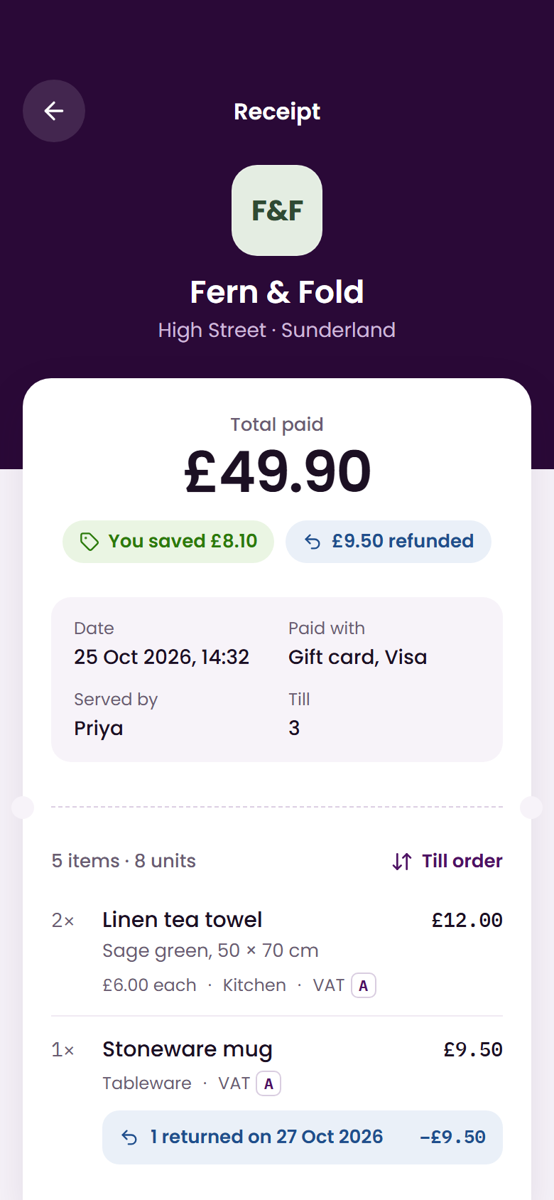
We wanted it to feel like a receipt, too, so it sits on a ticket with a dashed tear line and a serrated edge. Further down there is room for far more detail than a till roll could ever hold: a returned item shows when it came back and why, savings are broken down line by line, and there is a full VAT summary for anyone claiming expenses. Card terminal details are tucked away until you need them.
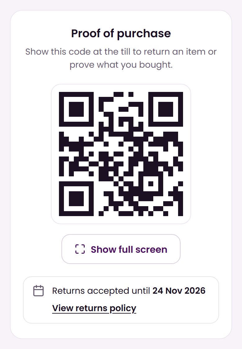
Returns have a section of their own. Proof of purchase puts the QR code you show in store front and centre, with a button to fill the screen with it and a clear reminder of the date your returns window closes.
Scan
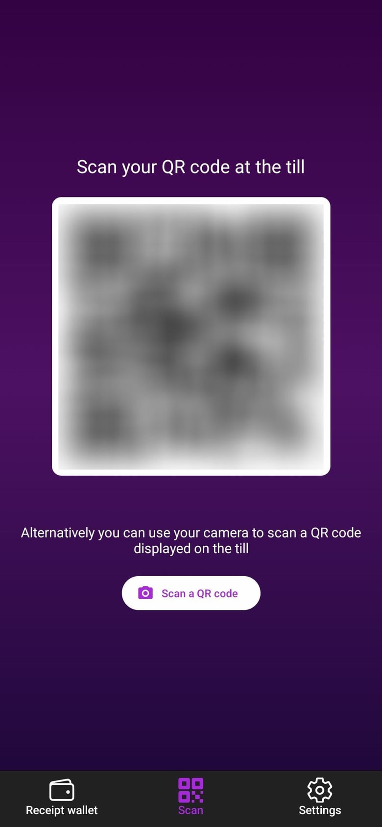
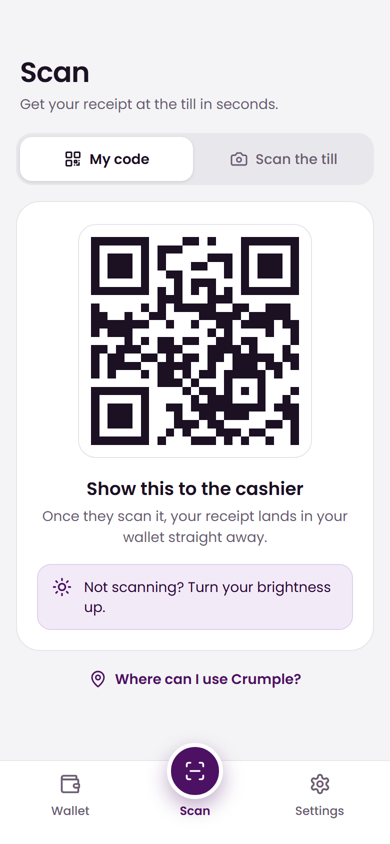
There are two ways to get a receipt at the till: the cashier scans your code, or you scan theirs. The old screen showed your code with the second option in a sentence beneath it. Now they are two clear modes, My code and Scan the till, with instructions for each and a helpful nudge to turn your brightness up if your code will not scan.
Before
After
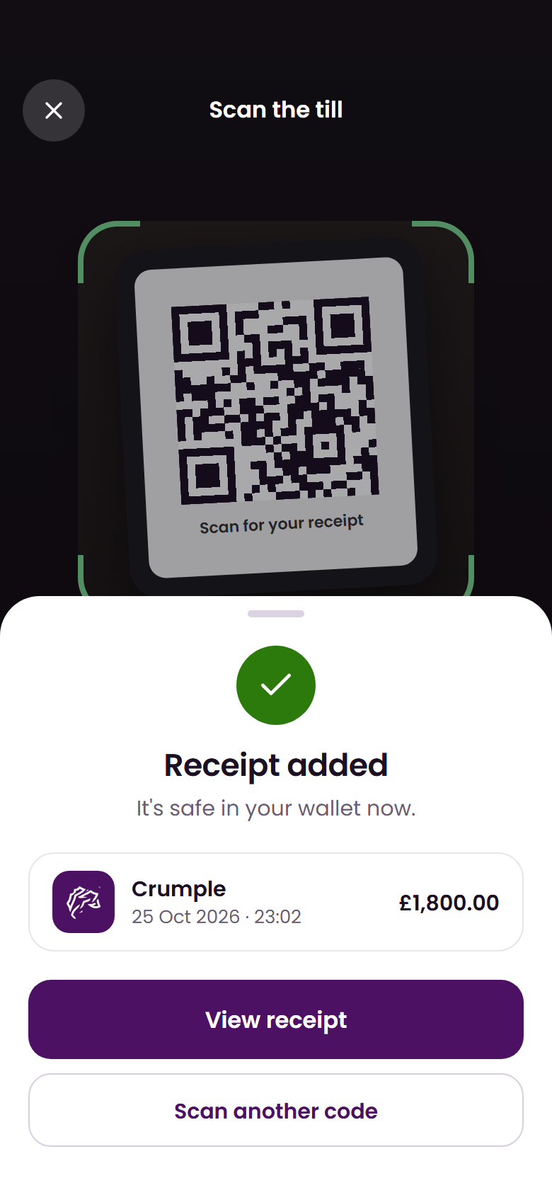
Scanning now also ends on a clear result. When a receipt lands in your wallet you see it straight away, with one tap to open it or scan another. If you scan one you already have, the app tells you that too.
Settings
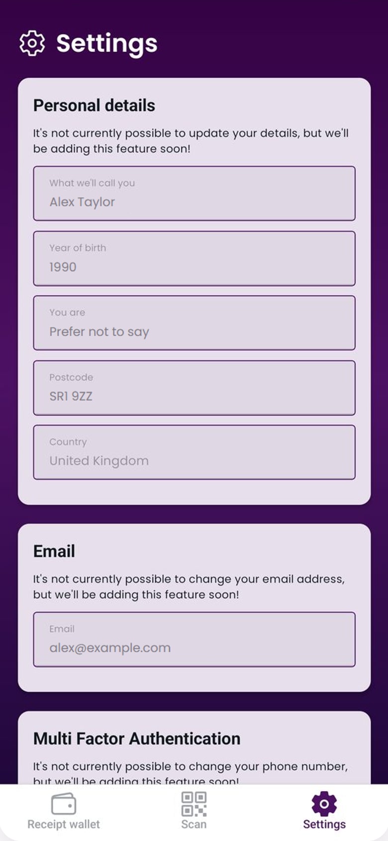
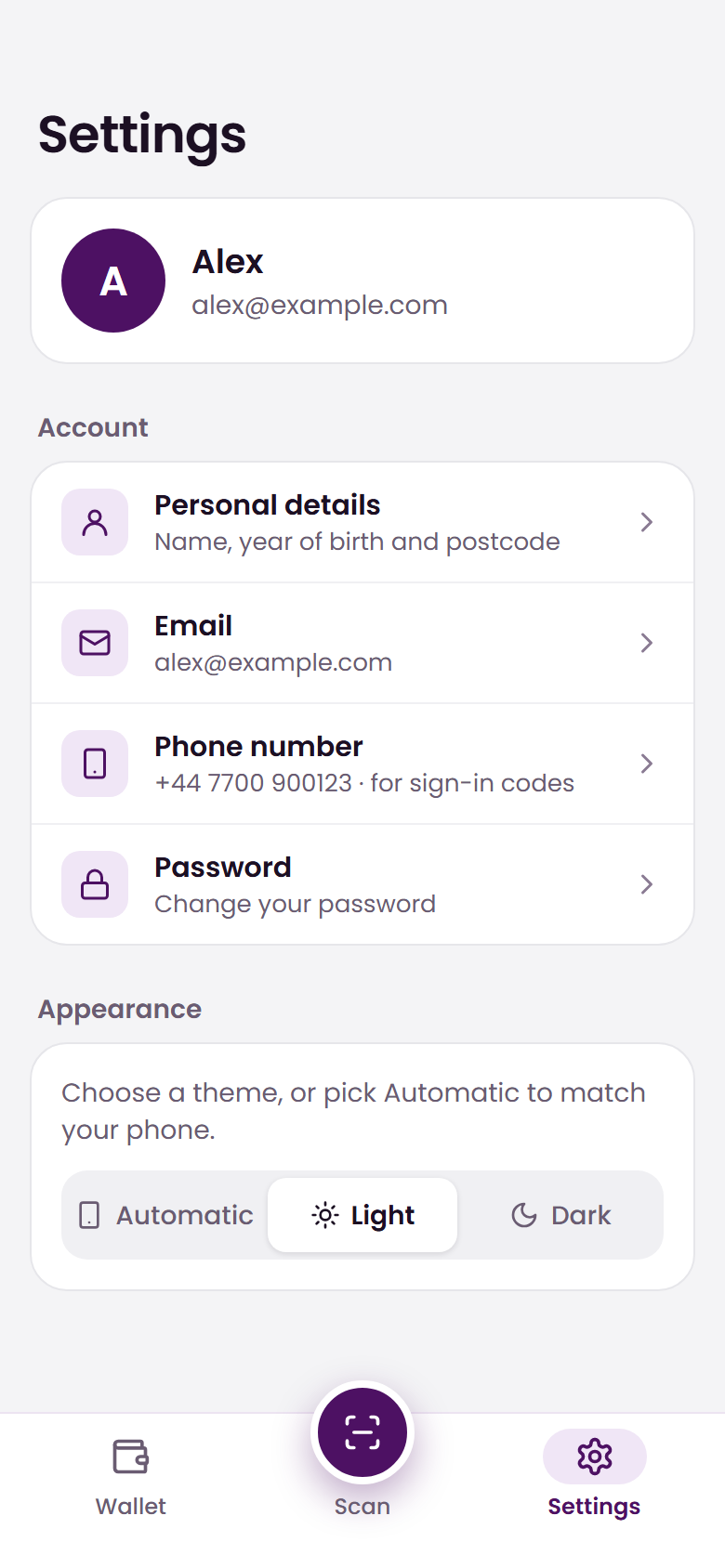
Settings used to be one long page of read-only fields, each with a note that changing it was coming soon. Now you can update your personal details, email and phone number from the app, and Settings is a short, organised list. Your profile sits at the top, followed by Account, Appearance, and Help and legal. Your personal details, email, phone number and password each have their own focused page, and your email and phone number are shown right there in the list, so you can check them at a glance.
Before
After
The small things
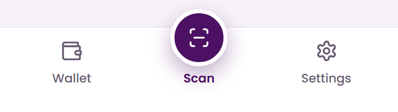
Some of the changes you will feel more than you will see. The tab bar has been rebuilt, with Scan raised in the centre so it is always easy to reach at the till.
Messages are more helpful, too. Errors now appear right beside the thing they relate to, rather than in a pop-up that the keyboard could cover, and alerts and dialogs share one look across the whole app.
Get the new look
If you already have Crumple, update to the latest version and the new design is yours. If you do not, download it free from the App Store or Google Play.
We would love to know what you think. Get in touch and tell us what you like, and what you would change.